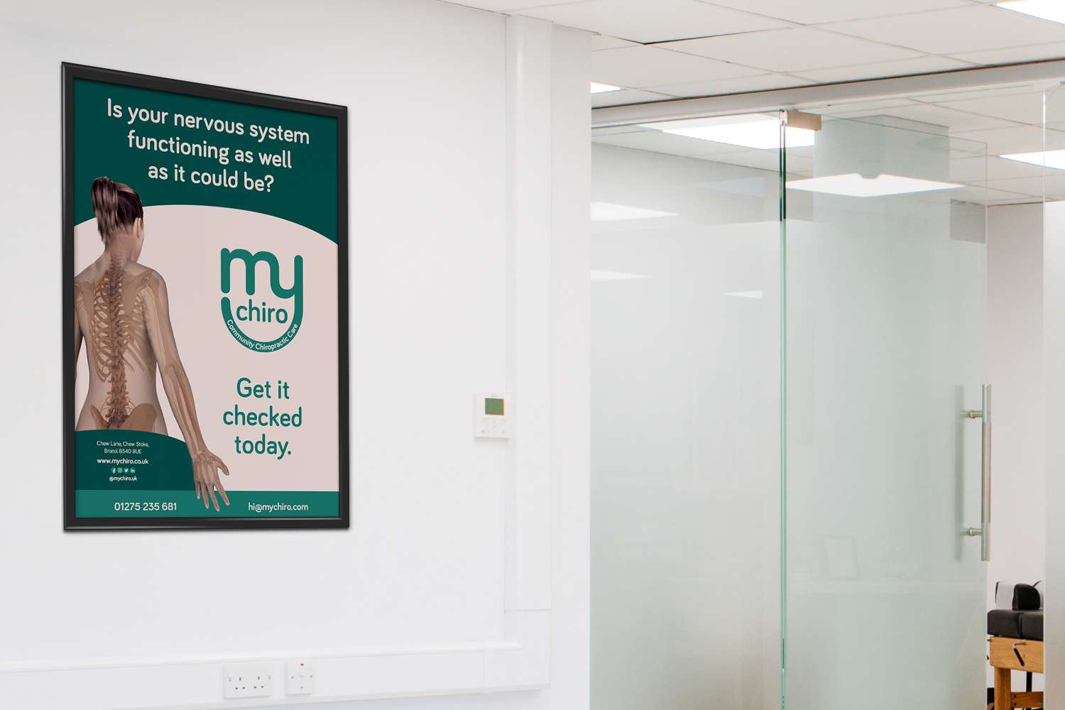
Rob got in contact with me in 2020, needing a start-to-finish branding package to help him set up his new practice. We started with some solid market research, then took our findings into the brand strategy and logo design, and finally applied his brand over a range of materials, all in preparation for day one of business.
In some cases, the standard icon and text logo format doesn’t work, and so a type-based solution is more appropriate. ‘My’ is a powerful word here that connects the chiropractor to the patient. ‘My Chiro’. Within this refined mark are several concepts:
‘Chiro’ is nestled within the ‘arm’ of the ‘y’. Creating a sense that there is a strong relationship between the practitioner and the patient. This fits with the brand statement: ‘Maintaining a personal, friend-like connection to clients.’
The logo flows in one continuous line – subtly symbolising the mind–body connection and the patient journey to better health. This fits with the brand statement: ‘Create patient journeys towards better health.’
The arm of the ‘y’ represents a smile. The smile that patients and families will have after visiting ‘their Chiro’. This fits with the brand statement: ‘Improve patient's function, and help them live healthier more fulfilling lives’.
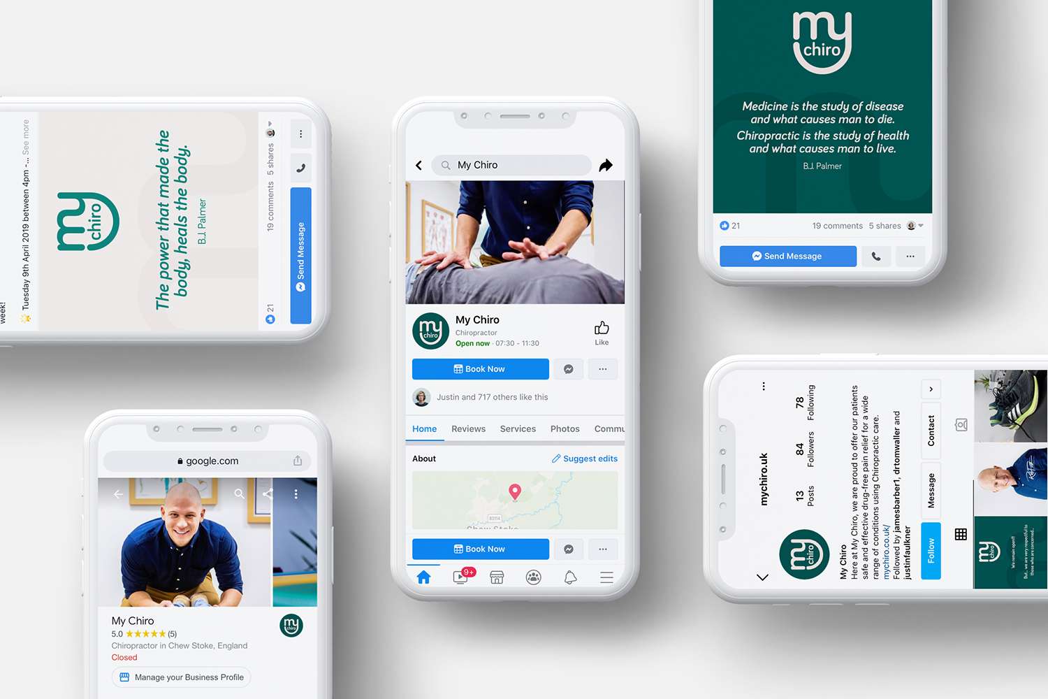
Website • mychiro.co.uk


Apply for a brand growth journey